Overall UX design with open source community and exploration of what forms UX work in an open source project can take.
Moodle Quiz: UI for creating and editing quizzes and exams, etc.
I championed teacher needs, discoveries originating from University of Tampere. I engaged the Moodle.org community to reconsider their UX priorities. After about a year of negotiation, I got a new, dramatically more novice friendly design accepted and implemented.
Recommendation available on LinkedIn profile.
ACM SIGCHI Finland awarded an honorary mention for my thesis on this work in their thesis competition.
I also made an initiative as a summer project to start creating a Human Interface Guidelines document for Moodle, though that eventually didn’t take off.
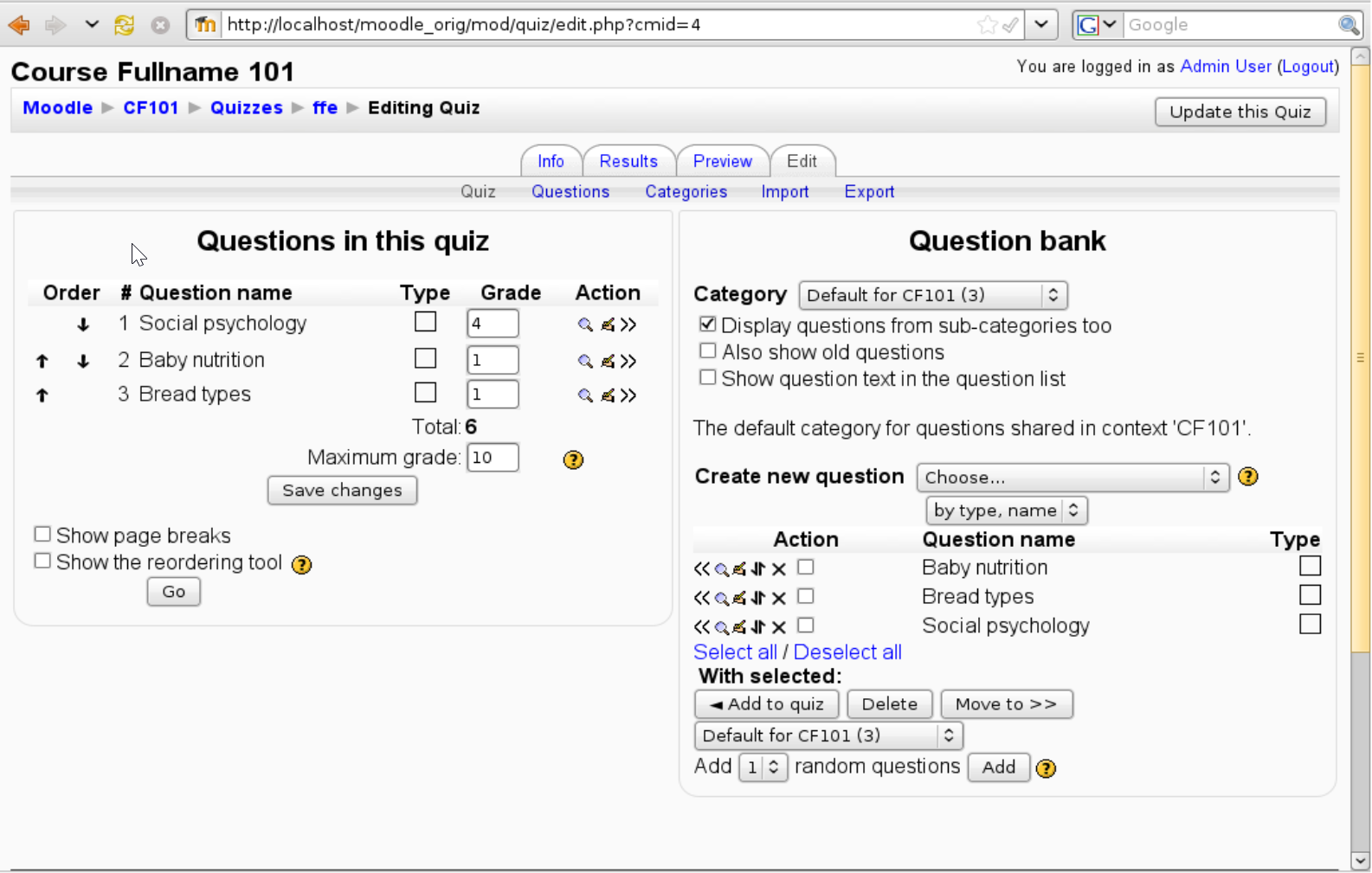
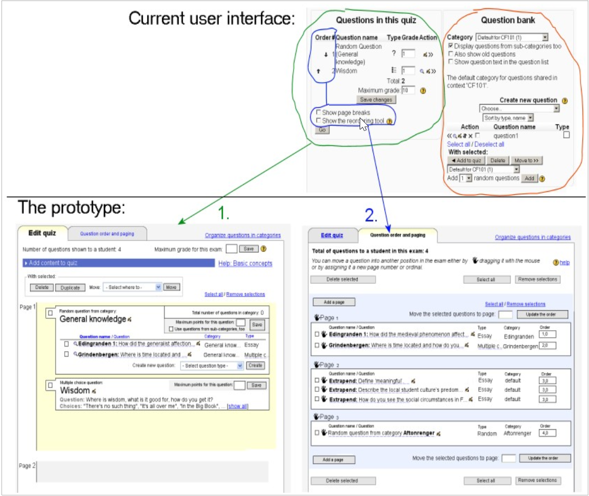
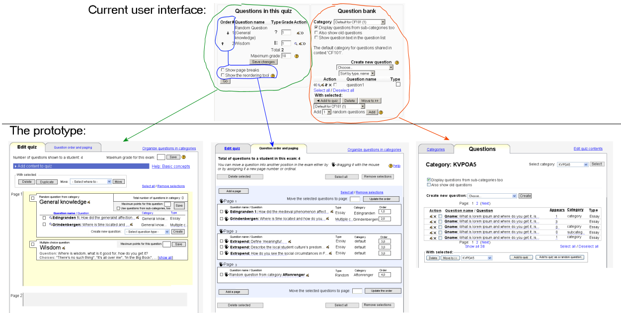
This is what the UI looked like before the project:
I created a bunch of prototype at various stages of the process. Both the prototypes and the eventual first implementation were usability tested, which is documented in my master’s thesis on this work. The work has been referred to in a couple of theses and discussed by Adam Hyde.
Moodle statistics state 531 million quiz questions created. Even taking into account older versions, it seems safe to say this design has affected millions of individuals.
Story with pictures
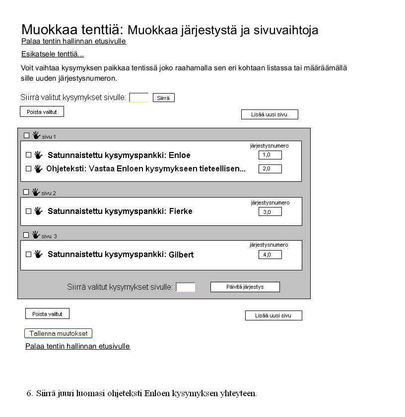
The fun thing is that the screenshot above is just the tip of the iceberg. The community work and time required to reach that simplicity visible in the third screenshot was very significant, taking several years.
How is it possible the challenge was that great? After all, the complexity level of the initial mockups is roughly the same as that of the resulting UI?
The difficulty of delivering this appears to have largely been due to change resistance. The conceptual model of the set of Moodle modules involved is complex. It is what the developers thought was necessary, having added features as time went by. As opposed to what I had thought at first, the issues were not on the surface level only.
The change resistance in the community was strong, even after getting the initial project cleared for implementation. I still had to accommodate the old conceptual model to a degree. So a lot of the old complexity had to be kept at first.
It was only after I had actually left the project that I found out they had gone through with the entire work, removing the question bank view from the Quiz editing UI entirely.
Original design proposition document:
Moodle Quiz UI redesign 2008
Description of the Needs, the Solutions and the Challenges of the project
See also: Preparation for and discussion about the UI and issues in the old UI. These documents also further explain the reasoning behind the new prototype (you can click ‘login as guest’ to see the discussion without a user id of your own).
The Needs
Most of all, I disagree with comments that we simply need better documentation for the quiz as a solution. Documentation is fine, but the interface should not require any reading in order for a new teacher to make a quiz. I have taught numerous teachers how to make a quiz in Moodle 1.3–1.7, and they are invariably confused unless I walk them step by step for over an hour. That should not be necessary.
-Don Hinkelman in the discussions about the UI
During the planning and the development of the Electronic Exam System it became apparent that the user interface of Moodle’s Quiz module suffers from several basic, fundamental usability issues. Especially the UI for creating new quizzes and later, managing them, proved problematic. As a result, teachers wishing to provide quizzes to students often send the data (quiz questions etc.) to IT support, who use the UI for them (!). This is the case in the University of Tampere currently, and as noted by users worldwide in the Moodle forums, we seem to not be an exception.
Many of these issues are such that they can be taken into account simply by taking a proven user-centric approach to the development. Namely, investigating the use cases and applying well-known heuristics, as well as doing preliminary usability testing have resulted in the new prototypes. The main guiding principle of the new UI is to allow users to focus more directly on the actual content they manipulate, as opposed to the application logic centric approach taken by the current UI.
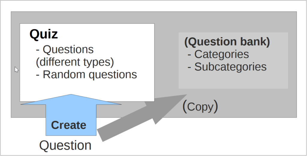
The situation with the current Quiz user interface is as follows: novice users aiming to create quizzes from scratch are overwhelmed by the amount of options the UI provides and have a very steep learning curve. The situation is worsened by the fact that the many aspects (categories, random questions) of the actual data model the user is supposed to manipulate are actually not communicated to the user at all by the current UI.
The Solutions
Below, I’m presenting the major changes in the UI model, and the reasoning behind them. In addition, there are several less critical problems, which require less fundamental changes to the UI. An example of this are the navigational tabs. In the current UI they behave in a non-standard manner, to the degree that novice users easily lose sight of where they are, or how they can get where they want using the navigation. This isn’t the primary focus of my work but will eventually be tackled in phase four of the project.
Problem: The main quiz editing screen (Edit -> Quiz) has three separate functionalities (category content management, quiz content management, quiz reordering/organizing), confusing users since the UI does not communicate what users are supposed to use it for.
Solution: Separate the functionality so that the user can concentrate on one task at a time. Do not overload the user’s cognitive space with unnecessary information for a given task. Category content management already has its own screen and thus the functionality can be removed from the Quiz content management screen. Reordering/organizing the content of the quiz is a central use case to managing a quiz, but since switching from and to is the reordering already a mode (triggered by a checkbox) in the old UI, we make that mode explicit by creating a separate, specially designed tab for managing the order and paging of the quiz.
Problem: In the main quiz editing screen, users are often unaware of the actual content of questions in the quiz or in the categories since they are not visible. They only see the question names. Alas, users are often unable to make the decisions they are in the screen for. It is not obvious for a novice, how to find out which question is where in the quiz.
Solution: Quiz content (the actual questions) is central to the task of creating or managing a quiz and this information needs to be readily available for that task. As we have above freed screen estate by moving unrelated functionality into screens of their own, we can fully concentrate on the quiz content in the main quiz editing screen. Also the content in the categories can be expanded at user request, for example using AJAX.
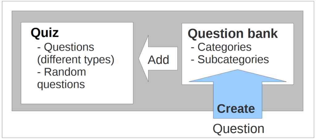
The core idea is thus dividing the UI into three simpler, separate parts, each having their own, clear function. Some concepts, such as a “random question” are fundamental to electronic exams, and as such possibly foreign to a novice user, so we provide quick help in the quiz editing screen explaining the concepts.
See also: diagram (PNG image 189 kb), the original UI design document
The Challenges
If Jakob’s Law is “users spend most of their time on other websites,” then Jakob’s Second Law is even more critical: “Users have several thousand times more experience with standard GUI controls than with any individual new design.” – Jakob Nielsen in his latest Alertbox column
As a developer for several web application UIs before Moodle, I try to stay sensitive for what most users are already accustomed to in most web UIs. This is to keep users’ learning curve minimal. However, as Moodle also has its own practices (documented or not), some of my initially proposed solutions may clash with Moodle’s current conventions. I plan to take the new UI as close as possible to Moodle’s existing standards without sacrificing usability. I do not see this as a showstopper: now that recent versions of Moodle even have YUI AJAX library included, I expect the current UI practices to be flexible enough. If there still are contradictions, I will listen to the community’s input.
During the discussions about the UI we have had at the developer forums, we discovered that there actually are two major use cases, with different ways of accessing the same functionality:
- One of them involves importing all the questions of a quiz, in batch, from an external file created in some other application. The Quiz module’s UI is used mainly for management of the quiz – this is more applicable for quizzes that contain lots of multiple choice questions (quantitative testing). For this, the usability problems of the current UI aren’t as critical, since the web UI is used less extensively used.
- The other major use case is creating an exam from scratch using the web UI – this is especially needed for creating essay type exams (qualitative testing). These exams have relatively fewer questions than what is needed in quantitative testing. The process consists of mainly creating questions, placing them in categories, and adding them into the quiz, as well as tweaking several options to adjust the overall behaviour of the quiz. It is critical that the user has the information available needed at each stage of the process – no more, to avoid confusion – and no less, to avoid having to skip around different screens to find the information needed at some stage.
However, as the changes required to enable the latter major use case involve major changes in the UI model, it has to be made sure that the new UI still supports also the former major use case. Before getting feedback from the community about a functional prototype it is impossible to know for sure, but as far as I know the major use cases, my current proposition supports both of the major use cases fluently. As verified in paper prototype tests, it supports the latter one dramatically better than the old UI.
An additional challenge is to keep the user interface from cluttering up as new features arise. The current plan does not yet take into account the Roles system introduced in Moodle 1.7, for example. I consider the challenge an interesting one, and compared to the old UI significant progress to unclutter the UI has already been made.
Overview
On this adventure I felt like a settler in a open source community that had no apparent prior exposure to systematic learning of user needs.
During my time in the community, I initiated a Human Interface Guidelines community process and did general usability consulting in various areas. I also advocated usability testing also for a Moodle development process standard.
The meritocratic nature of open source projects gives developers with no particular UX skills a lot of voice. We had to simplify gradually; build a more complex UI first to accommodate change resistance.
Moodle iMoot presentation
I was also asked to do a presentation in a Moodle online conference.